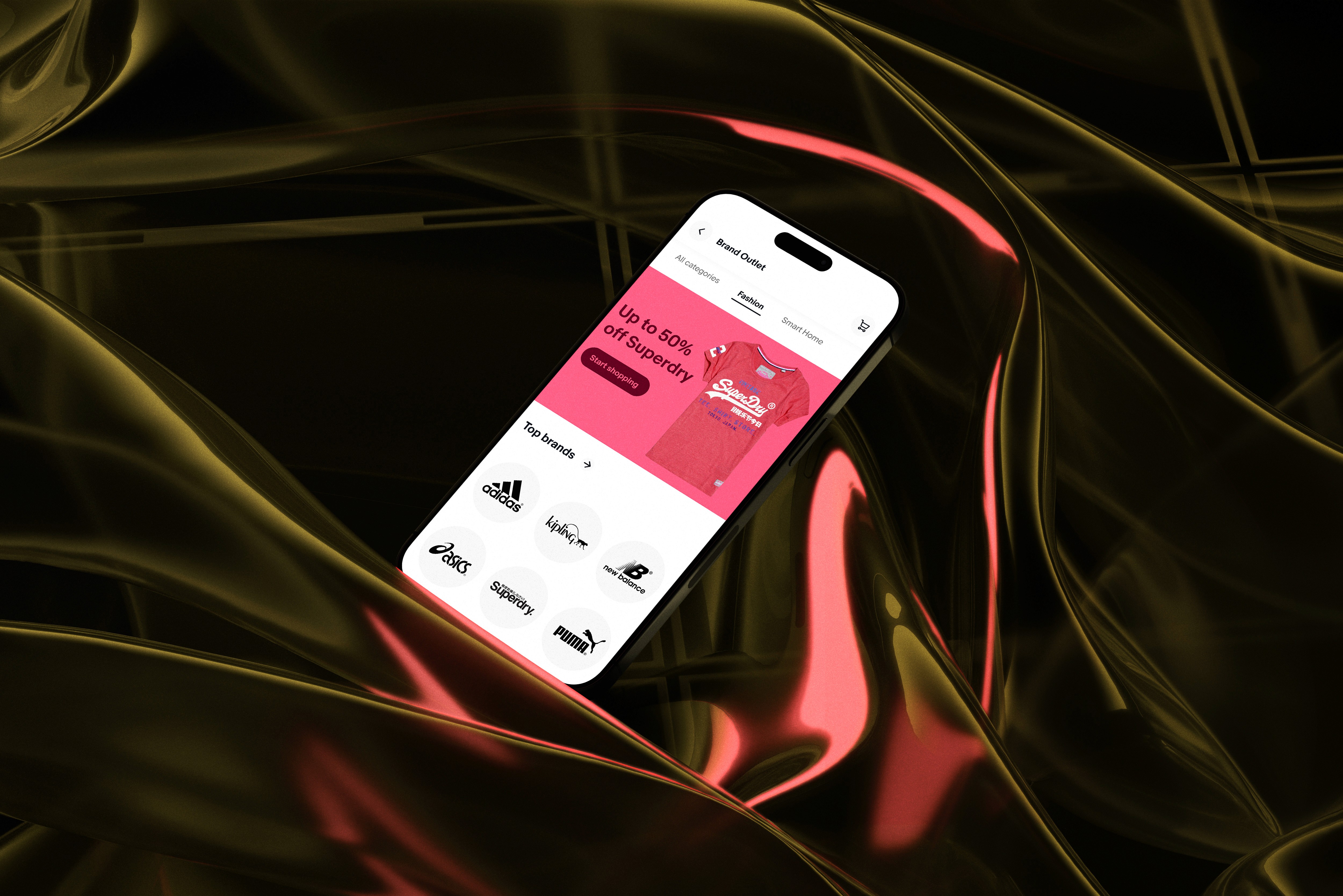

Case Study: Streamlining the eBay Shopping Experience
Role
Product Designer
Year
2023
Location
Remote
About
I led the redesign of the eBay app, focusing on modernizing its interface to enhance clarity and usability. My approach combined a deep understanding of user needs with innovative design strategies to simplify navigation and reduce the overwhelming amount of information users encountered. The new design improved the overall shopping experience, making it easier for users to find what they need and enjoy the journey.
1. Problem Identification & Research
Challenge: The eBay app's outdated design and cluttered interface made it difficult for users to quickly find relevant items and engage with the platform. Usability issues led to high bounce rates and user frustration.
Research Process: Conducted user interviews, analyzed app analytics, and reviewed user feedback to identify primary pain points, such as navigation complexity and visual clutter.
Key Findings:
Users struggled to locate frequently used features.
The overwhelming information on certain screens caused decision fatigue.
A lack of consistency across screens created confusion.
2. Defining Goals and Success Metrics
Primary Goal: Modernize the app by simplifying navigation, reducing information overload, and creating a consistent, visually appealing interface.
Success Metrics: Defined KPIs such as increased session time, improved user satisfaction ratings, reduced bounce rates, and higher engagement with core features.
3. Ideation and Concept Development
Approach:
Brainstormed solutions with cross-functional teams, including product managers, developers, and stakeholders, using Design Thinking workshops to align on goals.
Developed multiple low-fidelity sketches to explore layout options and information hierarchy that would cater to quick access and ease of use.
Key Concepts:
A modular design framework to allow for a cleaner layout.
Prioritization of essential features based on user needs.
Introduction of a consistent visual style to unify the look and feel across screens.
4. Wireframing and Prototyping
Wireframes: Created initial wireframes to test new layouts and navigation flows, focusing on simplifying high-traffic screens and making frequently used features more accessible.
Prototypes: Built interactive prototypes and conducted usability testing with a sample of users.
Testing Feedback: Gathered insights on what resonated with users and where adjustments were needed, such as improving the discoverability of certain features or refining the navigation flow.
5. Iterative Design and Refinement
Feedback Loop: Based on usability testing feedback, iterated on designs to address issues identified. For example, simplified some menu options and further reduced visual clutter based on user input.
Collaborative Refinement: Worked closely with developers to ensure that design elements were feasible and aligned with technical constraints.
Visual Design Enhancements: Implemented a modern, consistent visual style with updated icons, color schemes, and typography to enhance readability and appeal.
6. Final Design and Handoff
Final Deliverables: Prepared high-fidelity designs and design specifications for developers, ensuring that all elements met the goals for clarity, simplicity, and ease of use.
Design System Alignment: Collaborated with the design system team to ensure new components and styles could be easily integrated into eBay's design ecosystem.
7. Results and Reflections
Outcome: The redesigned app improved overall user engagement, with users reporting a more intuitive and enjoyable experience. Specific metrics like session duration and feature engagement saw noticeable increases.
Learnings: This project highlighted the importance of ongoing user feedback and adaptability throughout the design process, especially when dealing with a large, diverse user base.


